Strategic decisions are often complex. Yet, effective communication of strategy requires clarity. Research shows that one visualization strategy can significantly improve how stakeholders interpret and support a company’s direction. Despite this, few companies fully use this approach in their strategic communications.
Across 654 acquisition presentations analysed over five years, a compelling pattern emerged. Presentations that included a clear strategic visualization were more likely to generate immediate positive responses from investors. This article explores the reasons behind this effect,. It also shows how organizations can craft powerful visualizations that clearly express their strategic rationale.
Visuals Influence Market Confidence
On December 1, 2014, Cypress Semiconductor announced a $1.6 billion acquisition of Spansion. When the CEO presented this deal, the company’s stock rose 13%. A year later, the company’s market cap remained at that higher level. Investors had clearly understood and agreed with the strategic rationale.
In contrast, the Medicines Company presented a similarly valuable deal in 2012. Despite comparable long-term outcomes, investor reaction was mild. The share price rose only 1.8% on announcement. This difference is not isolated. Among the 654 deals studied, comparable transactions produced widely varying market responses.
What made the difference? A key factor was the inclusion of a strategic visualization. Presentations that used a one visualization strategy received significantly stronger investor approval. In fact, when a single strategic visual was included, positive valuation responses doubled. The effect was stronger than traditional visuals such as charts or photos.
Visuals Help Make Sense of Strategy
A business strategy is more than a list of objectives. It represents a set of choices and trade-offs, shaped by a specific context. The communication of these choices requires a cognitive framework. This framework, or “cognitive map,” is how executives make sense of their strategic environment.
Karl Weick, an expert in organizational psychology, described this process as “sensemaking.” Executives categorize competitors, customer needs, and resources. They sketch relationships between causes and effects. During strategy development, these ideas often appear as informal drawings—boxes, arrows, and diagrams.
Once a strategy is set, it must be communicated. That process, called “sensegiving,” requires others to internalize the strategy and act on it. Employees must align daily decisions with strategic priorities. Investors must understand the company’s value creation logic. A one visualization strategy can facilitate this transfer of understanding.
Capitec: A Case of Strategic Clarity
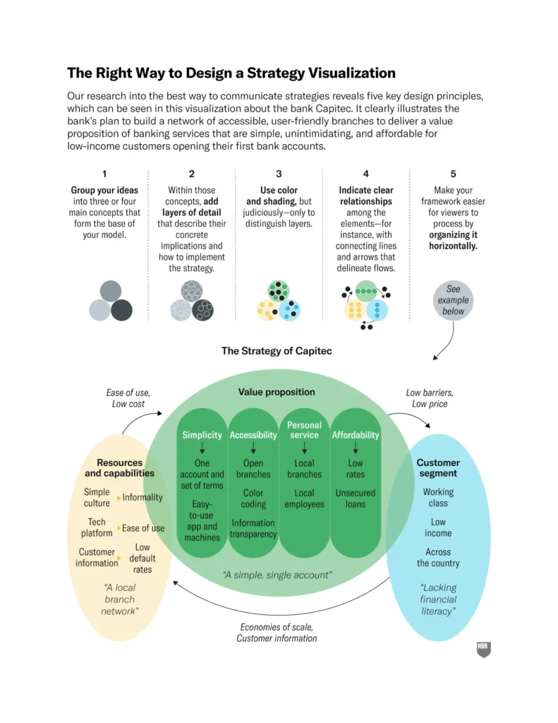
Capitec, now South Africa’s largest retail bank, offers a strong example. The company entered a market long dominated by four major banks. It targeted underbanked, low-income customers, whom it described as “lacking financial literacy.”
Capitec’s core value proposition was a “single, simple account.” To support this, it developed four reinforcing concepts: affordability, simplicity, accessibility, and personal service. Each concept translated into concrete operational choices.
Affordability meant charging very low fees. Simplicity involved offering only one type of account. Accessibility was addressed through physical branches with open designs and self-service tools. Personal service was delivered by hiring staff from the retail sector, who understood local communities.
This strategy implied specific resource investments. Capitec needed a wide network of branches and a simple technology platform. It also needed an informal, welcoming company culture—unlike the formal, hierarchical approach of its competitors.
The entire strategy could be presented on a single slide. The visualization showed three core concepts: target customer segment, value proposition, and required resources. Each was connected through clear relationships. Employees could use it as a guide. Investors could immediately grasp how the bank created value.
Source: Harvard Business Review (HBR, 2025)
Design Matters: Effective Visual Strategies
The human brain processes visual information more quickly than text. Over half of brain activity is devoted to visual tasks. This makes visual communication especially powerful in conveying strategy—if the design supports comprehension.
In a study of 60 corporate strategy visualizations, researchers used eye-tracking tools and executive interviews. Participants reported greater understanding when certain design elements were present. These principles are central to a one visualization strategy.
The first principle is simplicity. Frameworks should group ideas into three or four main concepts. Too many elements create confusion. Fewer components improve retention and comprehension.
Second, use layers. Each concept should offer deeper insights when needed. A viewer should be able to zoom into a part of the visual and understand additional detail.
Third, colour and shading should be functional. Use them only to distinguish layers or groupings. Decorative or excessive colour impairs understanding.
Fourth, relationships among elements should be shown with clear flows or connectors. People process stories more effectively when cause-and-effect relationships are visually apparent.
Finally, layouts should follow a horizontal structure. Human vision is naturally horizontal. This improves processing speed and comprehension.
Common Shortcomings in Strategic Visuals
Among the 654 acquisition presentations reviewed, only 170 included strategy visualizations. Of those, most followed some good design practices. Around 65% used horizontal layouts, and 71% clearly indicated relationships between components.
However, fewer than 20% delivered on all five design principles. The biggest gap was layering. Only 32% of visualizations included detail beyond the top layer. Without this, viewers could not connect abstract concepts to concrete actions.
When key ideas are buried, missing, or poorly structured, the visualization loses impact. In such cases, stakeholders struggle to retain or act on the strategy presented.
Testing the Effect of Good Design
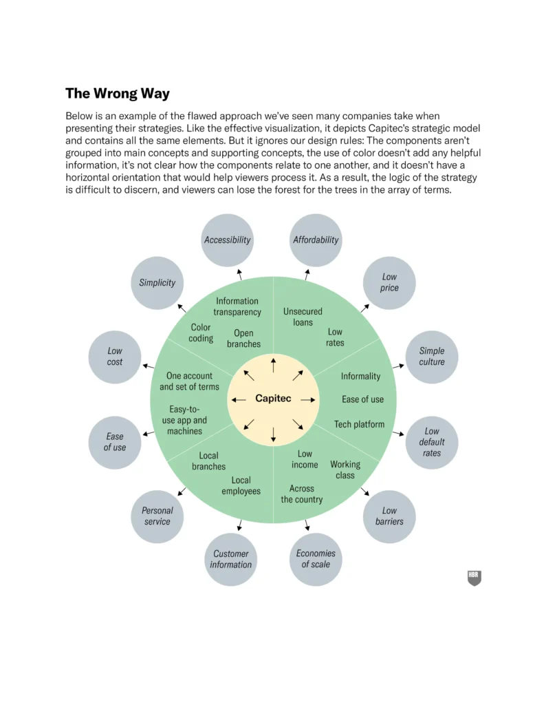
To confirm these insights, researchers tested two versions of Capitec’s strategy visual. One followed best practices. The other was more typical but flawed, with unclear structure and concentric circles.
Participants were asked to review one of the visuals and describe the strategy. Those who saw the effective visual scored over a point higher in comprehension, on a seven-point scale. They had a clearer understanding of how the bank operated and why.
Interestingly, both groups believed they had learned something. But only one group could accurately describe the strategy afterward. This demonstrates how effective design works quietly. A well-structured one visualization strategy embeds itself in the mind, often without conscious effort.
Source: Harvard Business Review (HBR, 2025)
Strategic Communication Requires Visual Precision
When executives present strategy, they often rely on slides and spoken words. But clarity depends on design, not just content. Strategies involve complex relationships and trade-offs. They guide decisions, shape operations, and influence perceptions.
A powerful one visualization strategy makes those relationships tangible. It aligns internal teams and external stakeholders around a shared understanding. Moreover, it supports consistency in decision-making. Also, it fosters confidence among investors.
A poorly designed visual can do the opposite. It confuses, distracts, or misleads. Worse still, it can create the illusion of clarity while leaving key concepts misunderstood.
A Strong Visualization Adds Real Value
The evidence is clear. Presentations that use a single, well-designed visual strategy framework enjoy stronger investor reactions. The impact can be immediate. In the long term, the benefits are even greater. Employees implement more effectively when they understand strategic priorities.
In a world of information overload, simplicity wins. One visualization can unite teams, attract investment, and communicate value. But only if it is done right.
Fewer than one in five strategic visuals today meet that standard. This presents an opportunity. Companies willing to invest in clear, layered, and purposeful visualizations will gain an edge, not only in communication but in execution.
The principle is simple but powerful: one visualization strategy should be enough to tell the whole story.
Source: Harvard Business Review (HBR, 2025)
At AFS, we are passionate about fostering innovation and empowering ambitious minds to flourish. Our mission is to provide best-in-class financial services for traditional and crypto deals, exploit European grants, and use quantitative methods to improve clients’ performance. We aim to help our customers unlock their full business potential.
Let’s unlock your enterprise’s full potential together!
Get in touch at [email protected].